
Budget Blinds
about.
Budget Blinds is North America’s leading provider of custom window coverings, specializing in tailored design consultations and professional installations. Their website serves as both an educational resource and a lead-generation tool, guiding users through window treatment options and encouraging them to book free consultations.
Client:
HFC Budget Blinds
Year:
2025
Role:
UX Research
Deliverables:
Usability Audit
Accessibility Audit
The Challenge
Conversion and drop-off metrics indicated opportunities for improvement. To boost engagement and lead form submissions, I conducted a comprehensive UX audit focusing on competitive differentiation, usability gaps, and ADA compliance.
The Scope
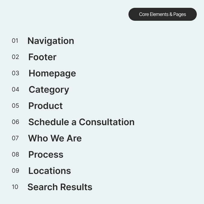
The audit targeted high-impact areas influencing user flow and conversions, including the homepage, navigation, category and product pages, and the consultation booking flow.
I applied a mixed-method approach that combined:
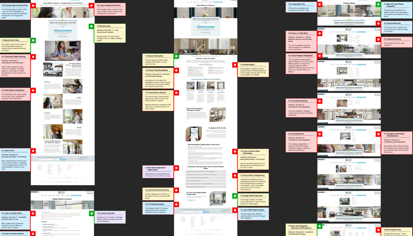
Heuristic Evaluation — Identified usability pain points through established UX principles.
WCAG Accessibility Review — Measured compliance with Level AA standards.
Competitive Benchmarking — Compared user flows, content structure, and accessibility across leading competitors.
The Process
The audit followed a structured, human-centered framework:
Set UX principles: Established core principles such as clarity, trust, accessibility, and engagement to align with Budget Blinds’ brand and user expectations.
Stay user-focused: Used personas and observed behaviors to frame evaluations from the customer’s perspective rather than a purely technical lens.
Evaluate thoroughly: Assessed the site using Nielsen Norman’s 10 Usability Heuristics and WCAG 2.1 guidelines, noting both critical violations and enhancement opportunities.


Findings
The audit uncovered several key usability and accessibility barriers impacting conversions:
Unclear conversion paths: Calls-to-action and consultation flows lacked visibility and hierarchy.
Dense content: Long-form copy overwhelmed users, obscuring key decision points.
Poor responsiveness: Layouts and navigation patterns broke down on mobile.
Prioritizations & Recommendations
All issues were categorized and prioritized by severity, user impact, and implementation effort, forming a clear roadmap for iterative improvement.
Key recommendations included:
Streamline lead form placement and navigation flow.
Simplify content hierarchy with stronger visual structure.
Redesign mobile templates for consistent responsiveness.
Establish accessibility guidelines for all future updates.


Outcomes & Lessons
The audit led to quick wins and longer-term strategic projects:
Consolidated four fragmented pages into a single, unified Process page.
Redefined category pages for improved scalability and conversion flow.
Enhanced accessibility standards across templates.
One big takeaway: this client relies heavily on data to make decisions. Sharing analytics and metrics upfront helped build trust and kept everyone aligned on priorities.